Author Archives: AtlasSigns

Marie and Joe Review Brunch at Madison’s Old Fashioned Restaurant

Another good “formula” restaurant with a large local following

Joe –  The Old Fashioned is just another of the burgeoning “quality comfort food” cafes and restaurants in the Madison area. On the plus side, the restaurant/pub does a great job of using local meats, produce, cheese, beer, and even liquor. It seems clean, the service is friendly and speedy, and the beer selection extensive (if you care). Their mission statement says they are inspired by Wisconsin taverns and supper clubs.

Marie – I found the atmosphere to be more tavern and less supper club. To me, supper club means a dinner menu of steak, prime rib, chicken, and, of course, a relish tray. When one of your claims to fame is a huge selection of tap beers, and your nightly specials include tacos and burgers, it is a tavern. Other than those trivial observations there is really not too much to say on the negative side that wouldn’t seem petty and personal, other than to caution about substituting mass quantities of food for quality. Overall, a fine experience that meets modest expectations. The owners are following a winning commercial formula and safely drawing a big crowd without pushing the envelope.

Joe – A few weeks after first visiting The Old Fashioned on Madison’s Capitol Square for an early lunch, a return trip was made on a recent Sunday morning for breakfast. In all honesty, the return for breakfast was prompted by the bloody mary being happily consumed by the person seated next to us during the previous  lunch. It was called The Wisconsin bloody mary, and is served with a side dish of snacks designed to appeal to the palate of a stereotypical Wisconsinite.

Arriving at a time that seemed to beat the rush, seating was immediately available at the bar. I started off by ordering the previously mentioned bloody mary and began cruising the brunch menu which has some interesting choices such as Walleye and Eggs, but mainly varied from Denny’s fare by the promised use of local fresh ingredients and flowery descriptions. My bloody mary arrived and it proved upon tasting to be a typical and non-inspired creation. The snack side plate was an interesting supper club type experience, but was pretty much, as expected, with a tender pickled egg, cheese curds, and a large portion of lean and tasty jerky. The curds were a bit of a disappointment both in number and size compared to portions I saw a couple of weeks earlier. For $8.50 this was probably a one-time experience.

Marie – I am so happy I didn’t blow eight bucks on a bloody mary. For my dining pleasure, I ordered the Chicken Fried Steak advertised as being a lightly breaded top-sirloin steak with sausage gravy. All I could think when it arrived was, what a huge hunk of meat that seemed to be. It was a monster covering most of a platter, but the illusion of size was accentuated by the very thick “lightly breaded” part. Actually the steak part was really good. The beef appeared to be high quality, and was was both flavorful and tender and wasn’t overly smothered by the gravy. The eggs were as ordered and, unlike yours, my roasted potatoes were hot in the center if not noteworthy in flavor. Although I won’t order this again unless I share it with someone, this was a meal that will bring me back to sample more of the menu.

Joe – I selected the Wisconsin Benedict with the bratwurst patty which turned out to be a great choice. The eggs were cooked as ordered, and the sausage had a pleasant mildly spiced taste that didn’t overwhelm the eggs or the english muffin. Rather than a standard hollandaise sauce, The Old Fashioned uses a mustard cream sauce that has a more robust flavor and pairs very nicely with the stronger flavor of the sausage. While many restaurants over apply hollandaise, this one left me wishing they would use a bit more. But, I will give this high marks for putting an interesting twist on standard fare.

The only real disappointment with my meal was the side of rosemary potatoes. They looked good with a nice crusty outside, but my order had some centers that were not quite done, and varied from having cold spots to being smoking hot. The non uniform temperature of the potato interiors combined with the very uniform exteriors leads me to believe that the potatoes are microwaved before plating which is certainly a shortcut that undermined an otherwise fine dish.

The Old Fashioned is one of the “in” places in town and you know that we are very happy for their success.

Marie – I guess this is one where we just can’t fight the  popular menu, great uptown location, mass quantities of food, and the instant camaraderie afforded by large crowds. So man-up Joe and admit that despite your whining, you will be back.

Joe – Count me in. I will return because this is an overall fine place, and a good fit for Madison.

We would like to hear about your thoughts and feelings about this post. Just send us an email and we will review with the intent of publishing if we feel it is appropriate. We are not averse to disagreement, and contrasting opinions will not disqualify your comments. We don’t publish links, shouting, vulgar language, or insults, but honor spirited discourse.

Atlas Adds “The Willow”, A New Craftsman Era Address Plaque

Photo of Willow Craftsman Era Address Plaque

Willow Craftsman Address Plaque

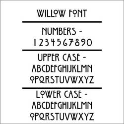
The Willow Font makes this address plaque really special to homes styled around the Arts and Crafts Movement

Willow font used on craftsman address plaque

Willow Font

We named our Willow Craftsman Address Plaque after the Willow Font that is used. The Willow Typeface is the work of Dave Fabik and only dates from 1995. Willow preserves the vintage Craftsman Style look of the more famous, and much older, Rennie Mackintosh font. but retains its own character and and adds little extra punch. Fabik’s Willow Font seems more legible to many. We think the readability of the Willow Font is due to its bolder profile and slightly more conventional numbers.

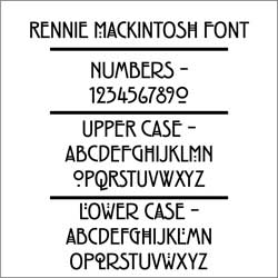
Photo of Rennie Mackintosh font used on Stickly Arts and Crafts Address Number Plaque

Rennie Mackintosh for Stickley Address Plaques

Although the Rennie Mackintosh Typeface is actually a period design, the numbers have been criticized as being so stylized that they are hard to read at a distance. While we very much like the uniqueness of Mackintosh, we agree that the tight curls of some of the numbers can be a bit confusing when read quickly. The similarities between the 2 and the 9 seem to cause most of the readability issues and can be an issue with address numbers that need to be read from a distance.

As a final note, it might be coincidental, but the willow leaf form was often used by one of the founders of the Arts and Crafts Movement, William Morris. All-in-all, the Willow is most appropriate for your Craftsman Style Building.

Sweetheart Initials Plaque Voted The World’s Best Romantic Valentines Gift

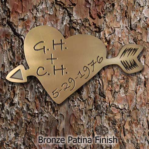
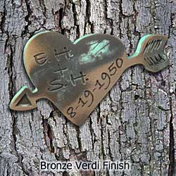
photo of cupids heart carved with initials and date

For Sweethearts

All of us at Atlas Signs and Plaques voted, and exit polling suggests that the Carved Initials Hanging Tree Plaque has taken the lead as the World’s Best Romantic Valentines Day Gift.

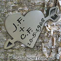
photo of silver nickel sweetheart carved heart

Also in Silver Nickel Finish

The Carved Initials Hanging Tree Plaque is a unique, personalized, custom Valentines Day gift for him, her, and both of you. Your initials, and those of your true love, in a romantic Heart Shaped Plaque that you can attach to a tree, fence, wall, headboard, or building. Cupids Arrow piercing a heart combined with your initials and special date.  What a great way to celebrate the day you met, the date of the proposal, wedding day, or some other little secretive date that only you two share.

Choose the Aged Bronze Verdi Look

There is one great reason for lovers to carve their initials into a tree, but many reasons why you shouldn’t. The reason to carve is obvious, but the reasons not to carve are not as apparent. You can harm the tree with your artwork.  All and all, it is a bad idea to carve, so go ahead and save a tree with a Sweetheart Tree Plaque. Order yours soon to bring smiles to your loved one on Valentines Day.

Handcrafted in the USA using American Materials and Labor.

Beautiful Winter Aerial View of Canandaigue Lake and Canandaigua NY

Aerial wintertime photo of Canandaigua Lake and Canandaigua New York

From 4000 feet

Aerial photo taken with Iphone 4 on January 10, 2011 of beautiful Canandaigua Lake

This is a photo looking north from mid-lake. You can see the city of Canandaigua just ahead of the airplane wing on the northwest corner of the lake. One on New York’s famed and beautiful Finger Lakes, Canandaigua Lake is over 15 miles long, north to south, but only a mile and a half wide. At over 275 feet of depth it seldom freezes even in the coldest of winters.

Getting Naked with the Apostrophe

Proper use of the apostrophe

Don't Be Afraid

Naked in the sense of honest, upfront, and basic.

Mostly, with signs and plaques, the issue revolves around the use of the lowly and misunderstood apostrophe.

The apostrophe is actually a tyrant and a bully. A bully? Yes because the apostrophe changes everything with one little mark, wielding power that is far out of proportion to its size and apparent importance. See, it is a tyrant too.

Here is a recap of how the apostrophe should be used to show possession.

Place the apostrophe before the s to show singular possession as in Ms Smith’s home. Names ending in an “s” or “s” sound are not required to have the second s added in possessive form, but it is the most often used method. Both Mr. Jones’ garden and Mr. Jones’s garden are fine with the second example usually preferable. To show plural possession, make the noun plural first. Then immediately use the apostrophe. As in the Joneses’ garden, or the Smiths’ home. Do not use an apostrophe for the plural of a name. As in the Nelsons have a an historic home. Use an apostrophe and an s after the second name only if two people possess the same item. As in Sally and Jim’s home. And finally, Don’t ever use an apostrophe with his, hers, its, theirs, ours, yours, whose. They do not require an apostrophe because the  words already show possession. See! Actually kind of easy and fun when you get the hang of it.

Is the customer always right? No! Yes! Maybe!

But the customer is always the final authority on the text included in signs and plaques created by Atlas Signs and Plaques. Ok, here is the dilemma. How, or even if,  to tell a customer that their punctuation is wrong, or probably wrong, or possibly wrong, or that they should do a little more research before locking in the text.

Most people don’t like to be told that they are wrong, especially if they are right. So what do we do at Atlas? We have to trust that you have done your homework and that what you send is the way you want it. Just be careful about the meaning you intend to convey. There are numerous websites that can help. You can even go to one of our previous blog postings about the apostrophe. But beware, we are experts in several fields and disciplines, but not the English Language. Use this as a starting point, but verify your decision from another source.

We would like to hear about your thoughts and feelings about this post. Just send us an email and we will review with the intent of publishing if we feel it is appropriate. We are not averse to disagreement, and contrasting opinions will not disqualify your comments. We don’t publish links, shouting, vulgar language, or insults, but honor spirited discourse.