Author Archives: AtlasSigns

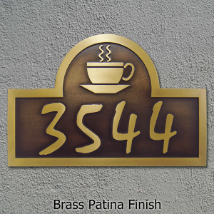
Featured Sign of the Week: Custom Coffee Shop Sign

Expresso Latte Comin Right Up

The drink has many names. Some call is Joe, some call it black gold. Some call it mojo, plasma, and java. This drink is, of course, Coffee. Though slighted in the past for being a contributor to insomnia, weight gain, and cellulite; coffee has been discovered to lower the regular drinkers chance of developing Parkinson’s, Alzheimer’s, and varying types of cancers. In light of this we have chosen our Arch Coffee Cup Address Plaque as our featured sign of the week.

This plaque is ideal for small, burgeoning café owners looking to add a little extra something to their overall product. Small café’s, as it turns out, import an estimated $12 billion worth of coffee beans annually to about 24,000 stores. We would love to make a coffee sign for each and every one of these owners (despite logistics); but we will settle for making one perfect sign for YOU.


As always our Signs are Made in the USA with American labor and American materials.

Pro Death Penalty, an Eye for an Eye

A Lasting Image of Justice

There has been a lot of hullaballoo about the death penalty in light of the Troy Davis execution (or murder, depending on your point of view). This commotion, centered on the Davis case, has escalated to the moral stratosphere adding fuel to death penalty abolitionist’s outrage. Arguing pro death penalty is  very tricky  to do without offending anyone. So I’m not even going to try. Here’s my opinion—people should suffer accordingly for their wrongdoings whether it’s a whoopin’ on the tush for disrespecting their mother or a needle in the vein for disrespecting the sovereignty of life.

The most basic argument in favor of the death penalty is deterrence. Deterrence works by letting would-be murderers know that if they should be found guilty of certain crimes, then their own lives are forfeit. It’s impossible to gather accurate statistical evidence on whether deterrence works; however, it is my sentiment that it does. Here’s why. Continue reading

The Colonial House: A Classic Style

English colonial home

The English Colonial

The colonial approach to architecture is as uniquely unified as it is varied. What on Earth does that mean? Let me explain. Colonial homes are unified in that they generally share the same basic appearance. To a modern eye that appearance would be “old” (among others). A basic rule of thumb is if a house looks old, really really old, then it’s probably a colonial. Beyond that are many differing styles, influenced by the heritage of the architects. These varying styles are what we will examine today.

The first recognized colonial era houses emerged in the early 1700’s as a direct result of early American prosperity. Although these structures vary greatly in details, they all share the same two discerning features. 1. They have many, many windows. 2. They have broad walls, and are imposing in appearance. That’s it—after all, it was a simpler time. Now let’s get into the stylistic details. Continue reading

Richard Neutra’s Typface: Neutraface

Richard Neutra

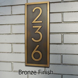
Neutraface Vertical House Numbers

Richard Neutra (1892 – 1970) is considered one of the most important architects of the modernist impression. His most famous works include: the Lovell house, the Gettysburg cyclorama (A turn-stile based panorama of the civil war battle), the Rice house, and the Von Sternberg house. The Von Sternberg house is of special importance because novelist/ philosopher Ayn Rand formerly owned the residence. According to Rand’s biographer, she bought the house in the 1940’s for $24,000 and sold it for $175,000. Not a bad investment, if you ask me. (Kind of like investing in their product. Big props if you know who they are.)

The Neutraface font, which is featured on our Neutraface Vertical Numbers plaque, takes many stylistic cues from both Neutra and Modernism. This influence is best seen through Neutraface’s numbers.

The numbers for this font have a very polar and unique style depending on which specific number is in question. Certain numbers have hard and sharp, crisp and firm lines; these are 3,4,5, and 7. They all share a very stern and formidable appearance. On the other hand; 2,6,8,9 and 0 all share a very rounded, almost plump look to them; especially 8. This styling difference contributes to making this font look very unique and eye catching—something all signs should strive to achieve.

This sign is also available in a horizontal format, so, as always with Atlas Signs and Plaques—you have options.

UPS vs. USPS: We Made the Switch

USPS vs UPS

Brown Box Here We Come

There’s been a bit of a change around Atlas Signs and Plaques. Today we have officially switched our shipping carrier from USPS to UPS. When considering shipping there are always a few things to consider: costs, technology, reliability, and features. The number one reason we switched is because UPS offers lower shipping costs. This means that we can translate those prices onto our products and make shipping costs less pricey for our buyer. So everyone saves.

The second big reason we made the switch is because customers often complained that USPS only delivers packages if you sign for said package, unlike UPS. This makes it hard for people getting home from work around 6:00, who arrive just in time for the post office to be closed for half an hour. So with UPS customers will always get their packages as soon as they arrive, and no later.

The third reason we chose UPS is because they offer some really cool software that allows us to take addresses from order batches and print shipping labels without manually typing in addresses and other shipping components. This means that we will be able to operate more efficiently as a business. It also means that you, the customer, will be able to track your orders online–a feature that USPS does not offer.

And finally, the final reason we made the switch was because UPS’s outbound pickup comes to us, when we want it, on time, without fail. In the high-octane business world, effective efficiency is of prime importance.

So, none of these reasons other than the first will directly impact the majority of our customers, just know that we have made the switch and UPS will now be our package carrier.